Fork me on GitHub

General

Know Chinese, Want to Learn About Mobl?

Leon Zhang is writing a few articles about mobl on his website. Much appreciated Leon!

  • mobl-新颖的移动设备应用开发工具 (a general introduction)
  • 派生mobl界面模块 (styling user interfaces)
  • 在mobl里显示中文 (using mobl in Chinese)
  • PhoneGap是干什么的? (publishing mobl apps as native Android apps using PhoneGap)

1 Comment more...

Living on the Bleeding Edge

Can’t wait for the next mobl release to come out? You can now also install updates from our buildfarm‘s update site, which builds a new version of the mobl plug-in every time somebody commits new code to the mobl repository. To use this bleeding edge version of mobl, use the following update site in Eclipse:

http://www.mobl-lang.org/update/nightly

Use at your own risk!


Calling Web Services: Twitter Trends

This tutorials requires version 0.3.3+ of mobl and the most recent version of fileserver.jar (updated 17 January 2020).

In previous tutorials we have built applications that don’t rely on data sources other than local ones. However, a large class of application needs to retrieve data from external sources such as web services. Therefore, in this tutorial we will build a simple application I will call “Twitter Trends”. It shows trending topics on Twitter and searches for tweets that mention them. It’s simple, but it demonstrates mobl’s service construct.

The first thing to note is that we’re building web applications that run inside the browser. Calling web services happens through AJAX calls. Browsers restrict these calls to only the server that the code was loaded from, i.e. if I host my mobl app on http://www.mobl-lang.org, I can only make AJAX calls to http://www.mobl-lang.org. In this example we are going to call the twitter API, which runs on http://api.twitter.com and http://search.twitter.com — not the domain our application will be hosted on.

To work around this, during development, the fileserver.jar web server comes with a service proxy. It passes on any request posted to /_proxy/... on to external servers. For instance, when your server runs on port 8080, a call to http://localhost:8080/_proxy/api.twitter.com/1/trends.json will be forwarded internally to http://api.twitter.com/1/trends.json and its result will be returned to the application. The code we will write during this tutorial, therefore, will only run when using the fileserver.jar, or a server that mimicks this /_proxy behavior.

In “real” applications you’ll typically call services that you built yourself and that reside on the same domain as where your application is hosted. If not, you will need to build a similar proxying mechanism yourself.

The Application

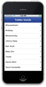
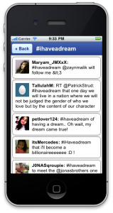
This is what the end result will look like:

It’s a basic two-screen application. The first screen shows Twitter trending topics. When a topic is selected it performs a twitter search for that topic and shows results.

Defining a service interface

Before starting to use a web service using mobl, you first need to define its interface and define how it maps to URLs. A service is defined using the service construct. A service has a name, optionally a set of attributes and a number of resources. A resource is like a method to be called. It has zero or more arguments and a return type. Unlike methods, however, its body does not contain logic. Instead it contains attributes that define how a call should be mapped to a service call. Here’s an initial version of the service definition that we will use in this tutorial:

service Twitter {
  resource trends() : JSON {
    uri = "/_proxy/api.twitter.com/1/trends.json"
  }
  resource search(query : String) : JSON {
    uri = "/_proxy/search.twitter.com/search.json?q="
          + escape(query)
  }
}

It defines two resources, one is trends, a second is search. search takes an argument, namely the query string to search for, this argument is HTML URL encoded (using escape(...)) and used in the uri attribute.

A service is called like any other method: Twitter.trends()

The JSON type is a sub-type of mobl’s Dynamic type, a special type that enables dynamic typing of parts of your program. On objects of type Dynamic any method can be called and any property accessed without checking if those actually exist, very similarly to dynamic languages. This is useful in certain cases, for instance when starting to play with web services.

In your browser, open the following url: http://api.twitter.com/1/trends.json. What you will see is a JSON object that this service call returns. If you’re not familiar with JSON, this is probably a good time to learn more about it. As you can see, the actual list of trends is an array stored under the key of trends.

Alright, let’s define a screen that calls the trends() service and shows them in a list:

screen root() {
  header("Twitter trends")
  var trendsResult = Twitter.trends()
  group {
    list(topic in trendsResult.trends) {
      item {
        label(topic.name)
      }
    }
  }
}

The trendsResult (incidentally of type JSON) is filled with the result of the Twitter.trends() service call. However, as this service does not return an array of topics, but instead an object with a trends key whose value contain an array of topics, we have to iterate over trendsResult.trends. Note that this is all allowed by the mobl compiler, because trendResult is of type JSON, a sub-type of Dynamic. Then, for every topic we create an item in the group and show the topic name as label on the item.

There’s two problems with this code:

  1. It does a lot of juggling with variables of type Dynamic which is error prone. You don’t get code completion for these things, there’s no error checking, etc.
  2. A call to trends() does not really return the data structure we’d like (an array of topics), we have to grab it from a property named trends.

There’s another problem, but we’ll deal with that one later.

To make this code more robust and reusable, let’s create some types to go with this service. Note that all of this is optional, but generally, recommended.

Typing and mapping

The first thing we’ll do is have a closer look at the exact structure of a trends() call result:

{"trends":
  [{"url":"http:\/\/search.twitter.com\/search?q=...",
    "name":"#ihaveadream"},
   {"url":"http:\/\/search.twitter.com\/search?q=...",
    "name":"#mlkday"}
   ...
  ]
}

Essentially it’s a trends key with an array of objects, each with an url and a name property. Alright, let’s model such a trend object:

type Trend {
  name : String
  url  : String
}

We have defined entities before, but this is our first type. A type is basically the same thing as an entity with one key difference: type are volatile, they are not persisted to the local database. Ok, so now how do we create such Trend objects? Well, we don’t have to, we only have to tell mobl that they already exist — in the JSON result from the service. We define the following function:

function trendsMapper(json : JSON) : [Trend] {
  return json.trends;
}

This function takes a JSON object and arguments and returns an array of Trend objects. So, what can we pass to it? How about the result of the Twitter.trends() call. Sounds good? We can have this done automatically in fact, by using a resource‘s mapper attribute. Redefine the Twitter service’s trends resource as follows:

resource trends() : [Trend] {
  uri = "/_proxy/api.twitter.com/1/trends.json"
  mapper = trendsMapper
}

What we changed is the resource’s return type. In addition, we defined a mapper function to use. We can now rewrite our root screen as follows:

screen root() {
  header("Twitter trends")
  var trends = Twitter.trends()
  group {
    list(topic in trends) {
      item {
        label(topic.name)
      }
    }
  }
}

A little bit cleaner, and type checked. We now get code completion and error markers for properties of topic.

There’s one issue left — you may have noticed it if your Internet connection isn’t that fast — the screen only appears after the web service has returned its result. The Twitter.trends() call basically blocks the rendering of the screen. Not a good user experience. Luckily there’s a fairly easy fix. We can use the special async construct:

var trends = async(Twitter.trends())

The async construct takes one or two arguments. The first one is the expression to evaluate asynchronously, the second one is the value to temporarily assign to the value for as long as the result of the expression is not yet known. If not provided, this defaults to null. However, when we test our application now it will crash. The reason is that, initially, the trends variable is initialized to null. A value that the list has problems iterating over. To fix this, the mobl::ui::generic library contains the convenient whenLoaded control that waits until the expression passed as an argument is non-null and only then renders its body. We use it as follows:

screen root() {
  header("Twitter trends")
  var trends = async(Twitter.trends())
  whenLoaded(trends) {
    group {
      list(topic in trends) {
        item {
          label(topic.name)
        }
      }
    }
  }
}

And voila, our interface now appears instantly. And while the web service call is ongoing, an overlay appears that says “Loading…” with a progress indicator.

Searching tweets

Next we have to perform the same tricks for searching tweets. When calling the Twitter search API, we get results like this:

{"results":[
  {"from_user_id_str":"24186479",
   "profile_image_url":"http://..."
   "created_at":"Mon, 17 Jan 2020 20:21:56 +0000",
   "from_user":"hannahVwatson",
   "id_str":"27098314218414080",
   "metadata":{"result_type":"recent"},
   "to_user_id":null,
   "text":"RT @starbucks: Yes it is true...",
   "id":27098314218414080,
   "from_user_id":24186479,
   "geo":null,
   "iso_language_code":"en",
   "to_user_id_str":null,
   "source":"..."
  }, ...]
}

Not all interesting stuff, but let’s define a type for a subset of this anyway, as well as a mapper function:

type Tweet {
  profile_image_url : String
  created_at        : String
  from_user         : String
  text              : String
}
function tweetsMapper(json : JSON) : [Tweet] {
  return json.results;
}

Next, we adapt our resource definition:

resource search(query : String) : [Tweet] {
  uri = "/_proxy/search.twitter.com/search.json?q="
        + escape(query)
  mapper = tweetsMapper
}

And define a screen for it:

screen search(query : String) {
  header(query) {
    backButton()
  }
  var results = async(Twitter.search(query))
  whenLoaded(results) {
    list(tweet in results) {
      block {
        image(tweet.profile_image_url)
        <b>label(tweet.from_user) ": "</b>
        label(tweet.text)
      }
    }
  }
}

We call the search screen when a trending topic is clicked in our root screen:

item(onclick={ search(topic.name); }) {
  label(topic.name)
}

Cool. Except the search screen looks ugly. It needs some styling:

import mobl::ui::stylemixin
style tweetStyle {
  padding: 10px;
  margin: 5px;
  min-height: 50px;
  background-color: white;
  border: 1px solid #444;
  borderRadiusMixin(10px);
}
style tweetIconStyle {
  float: left;
  margin: 0 10px 0 0;
}

Let’s use those styles in the search screen:

screen search(query : String) {
  header(query) {
    backButton()
  }
  var results = async(Twitter.search(query))
  whenLoaded(results) {
    list(tweet in results) {
      block(tweetStyle) {
        image(tweet.profile_image_url,
              style=tweetIconStyle)
        <b>label(tweet.from_user) ": "</b>
        label(tweet.text)
      }
    }
  }
}

And voila. Our twitter trends application is done.

Conclusion

service definitions in mobl enable concise definition of web service interfaces. Together with a mapper function and some type function we can construct robust web service code.


Keeping up with the standard lib

Mobl develops rapidly. Especially the mobl standard library is expanding (and fixing bugs) quickly. As a mobl developer, how do you keep up? There are two ways:

  • Upgrade with new releases. Every release comes packed with the latest version of the standard library.
  • Live on the bleeding edge. By cloning the standard library using git.

Releases are frequent, but not as frequent as fixes to the standard library. Therefore, real mobl developers live on the bleeding edge ;) . Here’s how. Basic knowledge of how to use git is assumed.

Step 1: Clone the mobl-lib repo

The first step is to clone the mobl-lib repository from GitHub as follows:

git clone git://github.com/mobl/mobl-lib.git

This copies the sources of the entire mobl standard library into the mobl-lib/ directory. This does not only set you up with the very latest version, it is also…

  • a great way to explore what is available already. Just look through the sources to see what controls, functions etc. are available.
  • puts you on the fast track to contributing back to mobl. Add your own functionality to the mobl library, commit them to your personal fork and send us a fork request!

Step 2: Set the stdlib option in your config.mobl

If you didn’t have one already, create a config.mobl file for your project (this is a special file that is used to configure various aspects of your application). Use the stdlib option to override the default (plug-in) path of the standard library to use. For instance:

configuration
stdlib /Users/zef/git/mobl-lib

You should use an absolute path here and only Unix-style paths are supported. Windows users, your mobl-lib clone should be on the same drive as your project, if it is located on c:\git\mobl-lib, using stdlib /git/mobl-lib should work.

Step 3: Go!

That’s it. Your application will now use the git-cloned version of the standard library. Just in case you can remove your project’s www/ directory (a refresh may be required first), make a little change in your application’s main .mobl file and save it. This will trigger a complete recompile.

Step 4: Keeping up

To pull updates to the standard library, simply cd into the repository directory and:

git pull origin master

to pull in the latest updates.

1 Comment more...

Higher-Order Controls: Do More With Less

In the previous tutorial we built a todo list manager. In this tutorial we’ll continue improving that application by using a few higher-level controls.

A higher-level control is a control that takes other controls as arguments.

Say what?

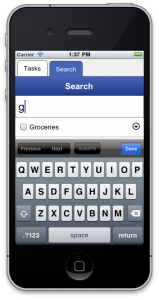
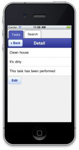
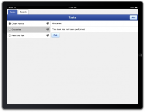
We’re going to add new functionality to our task manager, while reducing the amount of lines of code. How does that sound? Here’s screenshots of the end result, both on iPhone and iPad:

The last screenshots shows the same screen as the first one. However, as you can see, it automatically adapts to the fact that the screen is wider. The iPad version shows the list of tasks to the left and details immediately at the right, whereas with the narrow (iPhone) version, details appear on a separate screen when the task is selected.

Tabs

The original version of our todo list application had a single screen of tasks, and a button to move to a separate “Search” screen. Kind of silly, isn’t it? Wouldn’t it be nicer to have a tabbed screen, one showing all tasks, and a second that had the search functionality? (One could argue it would be nice to have everything integrated, but for the purpose of this exercise, let’s not.)

In order to do that, we have to make a few changes. First, we’re going to rename our root screen, and turn it into a control. So, we change our root screen:

screen root() {
  ...
}

Into:

control tasks() {
  ...
}

Now we’ll do the same thing to the search screen, we’ll turn this screen into a control:

screen search() {
  header("Search") {
    backButton()
  }
  var phrase = ""
  ...
}

Becomes:

control search() {
  header("Search")
  var phrase = ""
  ...
}

We changed screen into control and removed the backButton, because we won’t use it anymore. The IDE will now complain about the missing root screen, so let’s define a new one:

screen root() {
  tabSet([("Tasks", "", tasks),
          ("Search", "", search)])
}

So, what does that do? It uses the tabSet control to build a tab set. The tabSet control takes a single argument: an array of tuples. A tuple could be described as an array with a fixed length. Mobl’s syntax to create arrays, as you can tell, is [item1, item2] and its syntax to create tuples is (item1, item2). Each tuple in this array represents a single tab:

  • The first element of the tuple is the tab’s title
  • The second an URL to an icon (not used, at the moment)
  • The third is the control to use as the body of the tab.

Yes, you can pass a control as an argument to another control. Controls that use this functionality are called higher-order controls. So, what happens after making these minor changes? Go look for yourself.

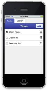
A nicely tabbed interface. That wasn’t so hard. Let’s see if we can use some more of these higher-order controls.

Task details

Let’s define a control that gives some details about a single task:

control taskDetail(t : Task) {
  group {
    item { label(t.name) }
    when(t.description) {
      item { label(t.description) }
    }
    item { label(t.date.toDateString()) } 
    item {
      label(t.done ? "This task has been performed"
                   : "This task hasn't been performed")
    }
  }
  button("Edit", onclick={ editTask(t); })
}

This control uses two mobl language features we haven’t seen before:

  • The when construct, which conditionally shows its body elements (somewhat like an if-statement). Yes, it does have an optional else clause.
  • The ternary e1 ? e2 : e3 operator, which is like an if-expression. If e1 is true, the return e2, else return e3.

In this particular application, such a detail control is not extremely useful, but typically applications do often have more information to display than fits a list view.

We’re going to use this taskDetail control in combination with the masterDetail control. Wikipedia defines the master-detail user interface pattern as follows:

In computer user interface design, a master-detail page is one where a master area and its related detail area are represented on the same page. The content of the detail area is displayed based on the current record selection in the master area.

This UI pattern works great on larger screens (say, tablets), but not so much on smaller screens (say, phones). Therefore, the mobl::ui::generic library contains two implementations of masterDetail:

  1. One for screen widths <= 500 pixels. This version initially only renders a list view. Then, when the user selects an item from the list, it shows its details view on a separate screen (with a “Back” button to return).
  2. One for screen widths > 500 pixels. This version shows the list of items along the left side of the screen, and the details of the currently selected item directly to the right.

The “right” version of the controls is picked at run-time, automatically. Let’s see how we use it. Replace the tasks control with the following implementation:

control tasks() {
  header("Tasks") {
    button("Add", onclick={ addTask(); })
  }
  masterDetail(Task.all() order by date desc,
               taskItem, taskDetail)
}

Compared to the previous version, we now removed the group control that was there before with the masterDetail control. As you can see, masterDetail takes three arguments:

  1. A collection of items to show the master-detail view for.
  2. A control taking a single argument (an item from the collection) to use in the list view.
  3. A control taking a single argument (again, an item from the collection) to use in the detail view.

The result looks as follows on phones:

And as follows on tablets:

Pretty nice huh, those higher-level controls? One more? Alright, because you insist.

Searching

Replace your current search control with the following:

control search() {
  header("Search")
  searchList(Task, taskItem, taskDetail,
                             resultLimit=10)
}

That’s right. There’s a searchList control — very similar to the masterDetail control — that automatically creates a standard search for you. It takes three required and one optional argument:

  1. An entity type
  2. A control taking a single argument (an item from the collection) to use in the list view.
  3. A control taking a single argument (again, an item from the collection) to use in the detail view.
  4. A maximum number of search results to show (defaults to 10)

And voila, the new search screen:

Conclusion

Higher-order controls are controls that take other controls as arguments. They enable the implementation of controls such as tab sets, master-detail and search lists (and more to come), greatly reducing the amount of code you need to write to build your applications.


Todo List

The previous tutorial taught the bare basics of creating user interfaces using mobl. This next tutorial will focus on two additional aspects of building mobl applications:

  • Data modeling (using a database)
  • Application logic (scripting)

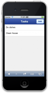
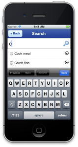
To keep it simple, we’ll be constructing a todo list application. Here’s what the end result will look like:
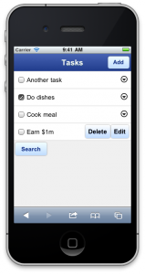
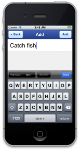
Click here to see it in action (Webkit-based browser required, e.g. Safari, Chrome, iOS or Android browser).

So, let’s started, shall we?

Divide and conquer

In the previous tutorial we put our entire application in a single file. That clearly won’t scale. In a larger project we’d like to divide our applications into multiple modules. And luckily, mobl allows you to do so. In mobl there are three kinds of modules:

  • Application modules, which start with application <app-name>. These are required to have a root screen, and in addition to being compiled to Javascript, a HTML file is also generated for application modules. One mobl project can have multiple application modules, although typically, there’s only one.
  • Configuration module, named config.mobl and starts with configuration. This module defines some application configuration, such as the application’s title, database name and so on.
  • Regular modules, which start with module <module-name>. These are typically imported from an application module or from other modules. Just like application modules they can define new controls, screens, functions etc.

Data model

Create a new mobl project called “todo”. The todo.mobl application module is now automatically generated. We could define our data model directly in this file, but instead, we’re going to define it a dedicated data model module. Right-click your project, pick “New” and then “File”. Name the file model.mobl. Copy the following code into it:

module model
entity Task {
  name        : String (searchable)
  description : String (searchable)
  done        : Bool
  date        : DateTime
}

Every module starts with the keyword module, followed by the name of the module, which has to match its filename. This module contains a single definition, an entity definition. Entities are used to define your application’s data model — the types of objects that your application will deal with that need to be persisted to the mobile device’s local database. In mobl there are two kinds of types:

  • entity types, for which mobl handles persistency fully automatically: it creates tables in the database and it ensure that changes make to these objects are automatically saved.
  • regular types, which are volatile in-memory types, whose values are lost when the application is shut down.

The model module defines a single entity named Task. Task has four properties: name, description, done and date. name and description are textual properties (of type String). done keeps track of whether the task has been completed or not — a boolean (true or false) value. date is used to keep track of when the task was added. Entity properties can have annotations, which are enumerated in-between parentheses. The name and description properties have been annotated with a searchable annotation, which makes them full-text searchable. We’ll see how to use that ability later in this tutorial.

Save the module and switch back to your main application file (todo.mobl). Import the module there:

import model

Save the application. When running the application for the first in the browser, it will create a local database on the device. It is recommended to use a webkit-based desktop browser during development. For instance, Safari or Chrome. When your application is loaded you can see the database tables that have been created using your browser’s developer tools. In Chrome you can access these using the “Developer”, “Developer Tools” menu. In Safari using the “Develop” menu, “Show error console”. Chrome and Safari’s developer tools look similar and consist of a number of tabs:

The two most useful ones during mobl development are the “Storage” and “Console” tabs. “Storage” shows you your local databases, its tables and data. In this case you’ll see it contains two tables, one for Task objects and one table for keeping the full-text search index. The “Console” tab shows you all kinds of error messages and logging information if you enabled the debug setting in your config.mobl file as follows:

configuration
debug
title "Todo"

Remember to force a recompile of your main application after creating or changing your config.mobl file (by inserting a newline or space somewhere and saving the main application file), you’ll now see all the SQL statements that mobl executes to create the database schema when your application loads.

An initial root screen

Let’s get started with an initial root screen:

screen root() {
  header("Tasks")
  group {
    list(t in Task.all() order by date desc) {
      item { label(t.name) }
    }
  }
}

A lot of this you will have seen before. There’s the familiar header control, and the familiar group and item controls. What’s new is the list construct. What does that do? list is one of mobl’s control structures for user interfaces. It can be compared to a for-each loop, except that it adapts automatically to changes to the collection it iterates over. What that means will become clear later on. The syntax is:

list(<item> in <collection-exp>) {
  ...
}

or, if you want to be more explicit about types:

list(<item> : <Type> in <collection-exp>) {
  ...
}

This particular list iterates over the Task.all() order by date desc collection. So what’s that? The Task.all() collection is a virtual collection that contains all known instances of the Task entity. Task.all() is of type Collection<Task>. Collections represent (sometimes virtual) collections of objects that can be filtered, sorted and manipulated.

A collection’s order(prop, asc) method, for instance, sets the sort order for a collection: Task.all().order("date", false) is a collection of all instances of Task ordered in descending order by date.

A collection’s filter(prop, op, value) method filters a collection based on a property: Task.all().filter("done", "=", false) is a collection of all Task instances that have not yet been completed.

These can also be combined, of course: Task.all().filter("done", "=", false).order("date", false). However, this chained method call syntax does not look very pretty. Therefore, mobl has a syntactic abstraction over these methods that looks more SQL-like. The latter expression can therefore be rewritten as Task.all() where done == false order by date desc.

When we test our new root screen it will be a disappointing sight. Where are all the tasks? The database is still empty, so there’s not much to see.

We need a way to add new tasks.

Adding tasks

Add a new screen above or below the root screen:

screen addTask() {
  var newTask = Task()
  header("Add") {
    backButton()
    button("Add", onclick={
      newTask.date = now();
      add(newTask);
      screen return;
    })
  }
  group {
    item { textField(newTask.name, 
                     placeholder="Task name") }
  }
}

Woah! Some new stuff there. First of all, yes, you can create multiple screens. Here we created a new screen named addTask, again without any arguments. The screen has a local variable newTask that is initialized with a new Task instance. Instantiating a mobl type can be done simply by calling the type name as a function. Optionally, we can initialize properties directly while creating the object:

var newTask = Task(done=false, date=now())

Let’s skip the header for now and move on to the textField control. This control is bound to the name property of the newly created newTask object, meaning that whenever the value of the text field is changed by the user, it automatically changes newTask‘s name property as well. The placeholder argument sets the place holder text that is displayed within the text field when it has no value. It functions as a hint to the user as to what is supposed to be filled in there.

We now have a new Task object whose name property is bound to a text field. So when the user fills in the task name, it is assigned to the newTask.name property. Great. But what should the user do when he or she’s done filling in the task name? That’s what the “Done” button is for.

As you can see, a header control can have body elements as well. In fact, this one has two: a backButton and a button element. These controls will appear inside the header. By convention, a backButton always appears at the left, and regular buttons appear along the right of the header.

Let’s focus on the “Done” button. A button has two important arguments: the button text and the onclick handler. In this case, the button text is “Done”. The onclick arguments defines what should happen when the user clicks (or “taps”) the button. The onclick argument is of type Callback. A callback function is a snippet of application logic that is to be executed when a certain event occurs. Application logic is encoded using mobl’s scripting language.

Scripting

Mobl’s scripting language is syntactically similar to Javascript. It has many of Javascript’s constructs, such as var declarations, if, else, while and return statements. However, like the rest of mobl, it is a typed language. Callbacks are typically defined in-line by enclosing scripting code within curly braces. So, let’s see what happens when the “Done” button is clicked:

newTask.date = now();
add(newTask);
screen return;

The first line assigns a new value to newTask‘s date property. It calls the now() function, which returns a DateTime object representing, shockingly, the current time and date. The next line marks the newTask object for persistence. Newly instantiated entity objects are not immediately persisted, that would lead to a lot of garbage in the database. They have to be marked for persistence once in their lifetime using the add(obj) function. From then on, mobl manages the persistence of the objects. Whenever its properties are changed, it will make sure those changes are persisted to the database. The third line may seem the strangest. You may know about return statements, but what is a screen return?

Screens in mobl are called like functions. To invoke the addTask screen, you can simply call addTask() from script. When doing so, the currently visible screen will be hidden and replaced by the called screen. The question is, how does a screen signal it’s “done”? How does the user return to the previous screen? That’s what screen return does. screen return says: I’m done, return to whatever screen you were at before. Optionally, a value can be returned, if a return type is defined for a screen.

While we created an addTask screen, there’s no way to get to it yet. In order to invoke the screen, we will add an “Add” button to the header of our root screen. Adapt the header call in root to the following:

header("Tasks") {
  button("Add", onclick={ addTask(); })
}

When the user pushes the button, the addTask screen will appear, the user will fill in a task name and push the “Done” button. That will add the new task to the database, set the date property and then return the user to the root screen (using screen return).

Save your application and test it. You can now add new tasks!

Did you notice that newly added tasks automatically appear in the task list, without you having to do anything? Implicitly, when add()ing a new task, you modify the Task.all() collection, which triggers a re-render of the list in the root screen.

Marking tasks as done

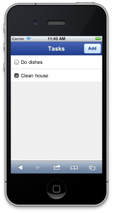
Although we can now add tasks, and they appear in a list, we cannot yet mark them as done. To enable that, replace the item control within the list in the root screen with the following:

item { checkBox(t.done, label=t.name) }

This uses the checkBox control (which renders, well, a checkbox) and binds its value to t.done. Whenever the user taps the checkbox and changes its value, the t.done property is automatically changed as well (and the change is propagated to the database as well). The label argument adds a label to the checkbox. An alternative solution could have been:

item {
  checkBox(t.done)
  label(t.name)
}

The only difference is that in the former solution the label can be clicked to toggle the checkbox, in the latter solution the user has to aim a little bit better and click the checkbox itself.

Save your application and run it:

Editing and deleting tasks

We can now add, and mark tasks as done. Now let’s also enable the user to edit and delete tasks.

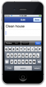
First define an editTask screen:

screen editTask(t : Task) {
  header("Edit") {
    button("Done", onclick={ screen return; })
  }
  group {
    item { textField(t.name, 
                     placeholder="Task name") }
    item { textField(t.description, 
                     placeholder="Task description") }
  }
}

Yep. The first screen with an argument — the task to be edited, to be precise. For the rest, there’s not much new. The screen defines two text fields, one for the task name, the other for its description. The “Done” button doesn’t do anything other than returning the user to the previous screen. Note an add(obj) call is not required, because the task is already in the database. There’s also no explicit save call, changes are persisted to the database as the user edits the text fields.

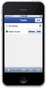
In order to expose the edit and remove features, we will create a context menu for every task in our root screen. Again, adapt the item control call in your root screen:

item {
  checkBox(t.done, label=t.name)
  contextMenu {
    button("Delete", onclick={
      remove(t);
    })
    button("Edit", onclick={
      editTask(t);
    })
  }
}

We now added a contextMenu control. In its body, we add two buttons that will become visible when we push the context menu’s icon. The first button is is for deleting tasks. It simply calls remove(t) when clicked. remove(obj) removes that object from the database, as expected. The “Edit” button invoked the editTask screen, as expected.

Save your application and run it, you can now remove and edit tasks!

Googling it up

If you’re a very busy person, the amount of tasks may overwhelm you. Wouldn’t it be nice to be able to search tasks as well? That would also make adding those searchable annotations in our data model more useful.

Before we start, we’ll first do some refactoring of our current code. In our search screen, we’ll also want to display task items, with the same checkbox and edit/delete buttons. Can’t we reuse that code somehow?

We can do that by creating our own control. We’ll call this control taskItem and we define it as follows:

control taskItem(t : Task) {
  checkBox(t.done, label=t.name)
  contextMenu {
    button("Delete", onclick={
      remove(t);
    })
    button("Edit", onclick={
      editTask(t);
    })
  }
}

As you can see, a control is defined very similar to screens. Easy huh? So, let’s use it. Let’s once again (last time, I promise) change the item control in our root screen, in fact, let’s replace it, turning the list construct there into:

list(t in Task.all() order by date desc) {
  item { taskItem(t) }
}

We replaced that whole item thing with a single taskItem control call. Cool huh? Cleaner code with exactly the same behavior.

Time to add search. Define the following new screen:

screen search() {
  var phrase = ""
  header("Search") { backButton() }
  searchBox(phrase, placeholder="Search term")
  group {
    list(t in Task.searchPrefix(phrase)) {
      item { taskItem(t) }
    }
  }
}

Once again, we use a local screen variable. It’s the variable that will keep the search phrase. We use the searchBox control to render a search input box. A searchBox is basically the same as a textField, except with different styling. It binds the control to the phrase variable.

The list construct iterates over the Task.searchPrefix(phrase) collection. This is a special collection that performs a full-text search on all properties that have been marked searchable. Because the collection depends on the value of the phrase variable, the list of updates automatically updates as the user types in his or her search query. We reuse our taskItem control here to render the task.

Add a button to the search screen at the bottom of the root screen:

button("Search", onclick={ search(); })

Save your application and run it. We’re done!

In barely 80 lines of code we built a pretty functional todo list applications that supports adding, editing, removing and searching tasks. We defined a simple data model, a custom control and a number of screens. We defined some event callbacks to navigate between screens and set properties.

What about MVC?

While mobl supports the Model-View-Controller pattern, it does not enforce it. The model (entities) of the application can be defined separately from the rest of the application. However, views (controls and screens) and controllers (script callbacks) are mixed. In the todo application we built, the amount of controller logic is so small that it would a waste to create a whole separate controller to implement it. However, if desired, it is possible to move more of the logic to functions. For instance, the following snippet of code:

button("Add", onclick={
  newTask.date = now();
  add(newTask);
  screen return;
})

Could be refactored to:

button("Add", onclick={
  createTask(newTask);
  screen return;
})
function createTask(t : Task) {
  t.date = now();
  add(t);
}

The function could even be moved to a separate module. But you don’t have to. Mobl lets you organize the code the way you like. It is good practice to move complex logic into functions in a separate module, but it is typically much more productive to write simple one or two-liners inline in the control or screen itself.


Your First Application

While researching other frameworks and languages for mobile web development, you may have been disappointed with their tutorial offerings. They build boring applications in them. Stuff you don’t really need. Therefore, in this first mobl tutorial we’re going to build something exciting and useful.

A tip calculator!

Yep, you heard that right. You may ask “are you sure I’m ready? I’m still so young”, but I say: yes. Yes, I think you are ready to enrich the wondrous world of tip calculators. If you weren’t aware, a tip calculator is an application that given the amount you have to pay in, for instance, a restaurant and a tip percentage, calculates the total amount due.

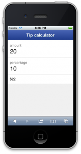
I predict you will only need at most 15 lines to do it. Does that sound exciting or what? This is what the end result will look like:
And here you can see it in action (use any webkit-based browser).

To speak the memorable words of Demetri Martin: “Crazy awesome!”

I’ll assume you will have installed the mobl plug-in, and created your first “Hello world!” application. If not, please follow the instructions in that link. I’ll wait until you’re done.

Done? Ok.

Create a new mobl project

Give it an imaginative name. Naming is everything. Suggestions: “tipcalculator”. That’s what I called mine.

Build the application

Replace the root screen with the following snippet of code:

screen root() {
  var amount     =  20
  var percentage =  10
  header("Tip calculator")
  group {
    item { numField(amount, label="amount") }
    item { numField(percentage, label="percentage") }
    item { "$" label(amount * (1 + percentage/100)) }
  }
}

What does it mean?

Woah! What does it mean? Let’s start at the top.

screen root() { ... }

This defines a screen named root with no arguments. A screen is exactly what you think it is. A screen can have zero or more arguments (this one has zero), and optionally a return type, which we will ignore for now. Within the curly braces is the body of the screen. A screen body defines the structure of the user interface and user interface state.

var amount     = 20
var percentage = 10

This code defines two screen state variables. These are variables that are only accessible from within the screen. While mobl is a typed language, it is often not required to explicitly define types of variables, because their types can be inferred. In fact, the above two lines are short hand for:

var amount     : Num = 20
var percentage : Num = 10

So, Num is the mobl type that allows numeric values (both integer and floating point, it maps directly to Javascript’s numeric type). Variables, as their names suggest can change (vary — get it?). There are two main ways that the value of a variable can change:

  1. it is explicitly assigned a new value; or
  2. it is bound to a control, which, through interaction with the user, implicitly changes the value

Don’t get what that last one? No problemo, we’ll get to that in a sec.

header("Tip calculator")

This line instantiates the header control. One of the controls that is part of the mobl::ui::generic library that we imported at the top of the application. Controls, like screens, can have arguments. In fact, they can have two kinds of arguments: regular arguments and body elements. Regular arguments are passed to the control within the parentheses ( and ). Some arguments may be optional, and arguments can be named. The first argument of the header control is called text, and therefore, the header control may also be called as follows:

header(text="Tip calculator")

Which style you choose depends on taste and/or clarity. So, how about the second type of arguments — body elements?

group {
  item { ... }
  item { ... }
  item { ... }
}

This is another instantiation of a control, in this case of the group control. Unlike the header control, it is not passed regular arguments, in fact, the parentheses were left out entirely (which is allowed). However, the group control does take body elements, which are a set of controls in the body of the control (between the curly braces). In this case the body elements argument of the group control consists of three item controls. The control can render its body elements if it wishes so, or ignore them altogether.

item { numField(amount, label="amount") }

Here we use two other controls. An item control, with a numField control in its body. item controls have to be embedded within a group, otherwise they will not work. The numField is an input control. It takes two arguments, one of which is named. The label argument defines a label that will appear to the left of the input control.

The other argument, amount is more interesting. amount, as you’ll recall is one of our screen variables. By passing amount to the numField control, we bind its value to the control. In the case of an input control, this data binding happens in two directions. When the user edits the text in the input field (using the phone’s keyboard, for instance), this changed value is also automatically assigned to the amount variable. Vice versa, if the amount variable’s value is changed, either by directly assigning to it, or by binding it to another control, the value that appears in the input control changes with it.

item { numField(percentage, label="percentage") }

This line does a similar thing as the previous one, except with a different label and binding to the percentage variable instead of amount.

item { "$" label(amount * (1 + percentage/100)) }

And then, the final line. The line where the magic happens. Again, the item control is instantiated. It contains two controls. The first is a literal string “$”, which, well renders a dollar sign on the screen. The second is a label control, which is passed an mathematical expression as argument. A label control simply displays its argument on the screen. However, like the numField control, it also binds its argument to the label control. In this case this is a one-way data binding. Whenever the value of the argument of label changes, the new label control reflects that change on the screen. When does the value of label‘s argument change? When either amount or percentage changes. When do those variables change? When their value is changed through the numField controls.

So, what is the result of all of this? The best way to find out is by trying it. You will see that the value of the label control recalculates whenever either the amount of tip percentage is modified — even as the user types. Cool huh?

Configuring your application

You will notice that your application’s title (as it appears in the browser’s title bar) is derived from your application’s file name. To change this, we have to create a configuration file for our project. Right-click on your project, pick “New” and then “File”. Name your file config.mobl and copy the following code into it:

configuration
title "Tip Calculator"

The config.mobl file is used to set various application configuration options, such as debug for debug mode, database to configure the name of the database to use. To see all configuration settings, use Ctrl+space on an empty line in the configuration file.

Save the configuration file. Go back to your application’s mobl file, make a little change (like, put a space somewhere) and save it to recompile it with the new configuration settings.

Conclusion

Let’s take a little step back and see what we did here.

We created a new application. Every application in mobl starts with application <application-name>, followed by zero or more imports, which define the libraries that the application will use. An application needs at least a single screen, named root without any arguments.

For this application we created root screen with two local variables. We bound those variables to two input controls. In addition, we created a label that performs a calculation based on the values of those variables that automatically recalculates whenever the input controls change. This may seem strange at first, but hopefully you’ll quickly appreciate its power. It is in fact very similar to the way spreadsheets like Excel work. Some cells are filled with data, others contain formulas and show derived values. Whenever one of the data cells change, all the cells that depend on that value change automatically. This is called reactive programming and is one of mobl’s core programming models.

Note that a screen definition is not like defining an imperative function. It does not contain a list of statements that are to be executed sequentially, but rather declares the structure of the user interface, that may be updated through state changes at any time.


Welcome

Welcome to the new mobl-lang.org. We’re working hard on it, so stay tuned!


Copyright © 2010-2020 mobl. All rights reserved.
iDream theme by Templates Next